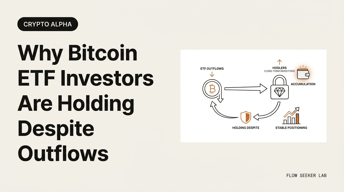
Why Bitcoin ETF Investors Are Holding Despite Outflows
Why Bitcoin ETF Investors Are Holding Despite Outflows
The headline said billions were fleeing. The data underneath said almost nobody left.
For most of the past two weeks, every crypto feed I follow ran the same red number — Bitcoin ETF outflows, day after day, the longest streak since these products launched. So I want to walk through why Bitcoin ETF investors are holding despite outflows — not as a prediction, but as a read of what the flow data and the sentiment data actually say when you stop reacting to the headline and start reading the plumbing underneath.
Here’s the preview. I’ll separate the scary number from the boring reason behind it, show you the one metric that contradicts the panic, and give you the three-line frame I now run before I let any “billions exited” headline change how I think.
I got this wrong once. So this isn’t a lecture. It’s the correction I had to make.
The signal that looked like a fire alarm
Let me set the scene with the numbers, then question them.
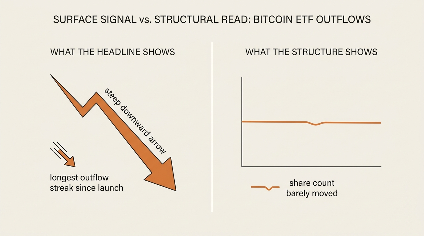
In late May and early June 2026, US spot Bitcoin ETFs posted a redemption streak that ran roughly twelve to thirteen trading days. Depending on which outlet you read, somewhere around $4 billion left the funds over that window — reports ranged from about $3.4 billion to $4.4 billion, which itself tells you something about how messy same-day flow data is. By the count most outlets agreed on, that was the longest stretch of Bitcoin ETF outflows since the products began trading in 2024.
At the same time, the Crypto Fear & Greed Index sat deep in “Extreme Fear.” Early-June readings clustered in the single digits and low teens — numbers like 8, 11, 12. You can watch that gauge yourself on the official Fear & Greed Index, and on publish day it will read something different than it did when I drafted this. That’s the point. It moves with mood.
So the surface story wrote itself. Money leaving the funds, fear pinned to the floor, a multi-week streak of red. If you only read the top line, you’d assume the people who bought these ETFs were stampeding for the exit.
They mostly weren’t. And the gap between those two facts is the whole reason this post exists.
The interpretation almost everyone reached for
The default reading of Bitcoin ETF outflows is simple: outflow equals selling, selling equals bearish, bearish equals get out. It’s clean. It’s also incomplete.
I reached for that exact interpretation in 2024, the first time I watched one of these streaks. I saw a week of redemptions, decided “institutions are leaving,” and treated the flow number as a verdict on conviction. I was reading a plumbing statistic as if it were a sentiment poll.
Here’s what that view misses. An ETF outflow is a mechanical event, not an emotional one. When more shares are redeemed than created on a given day, the fund reports a net outflow — full stop. That redemption can come from a long-term holder losing faith. It can also come from an arbitrage desk unwinding a trade, a market maker rebalancing, or a basis trade closing as futures and spot prices converge. The flow number doesn’t tell you which.
So “money is leaving” is true and almost useless at the same time. The honest question isn’t how much left. It’s who left, and whether the people who actually believe in the thing are still in it.
The metric that contradicted the panic
This is where the Bloomberg ETF analysts earned their reputation.
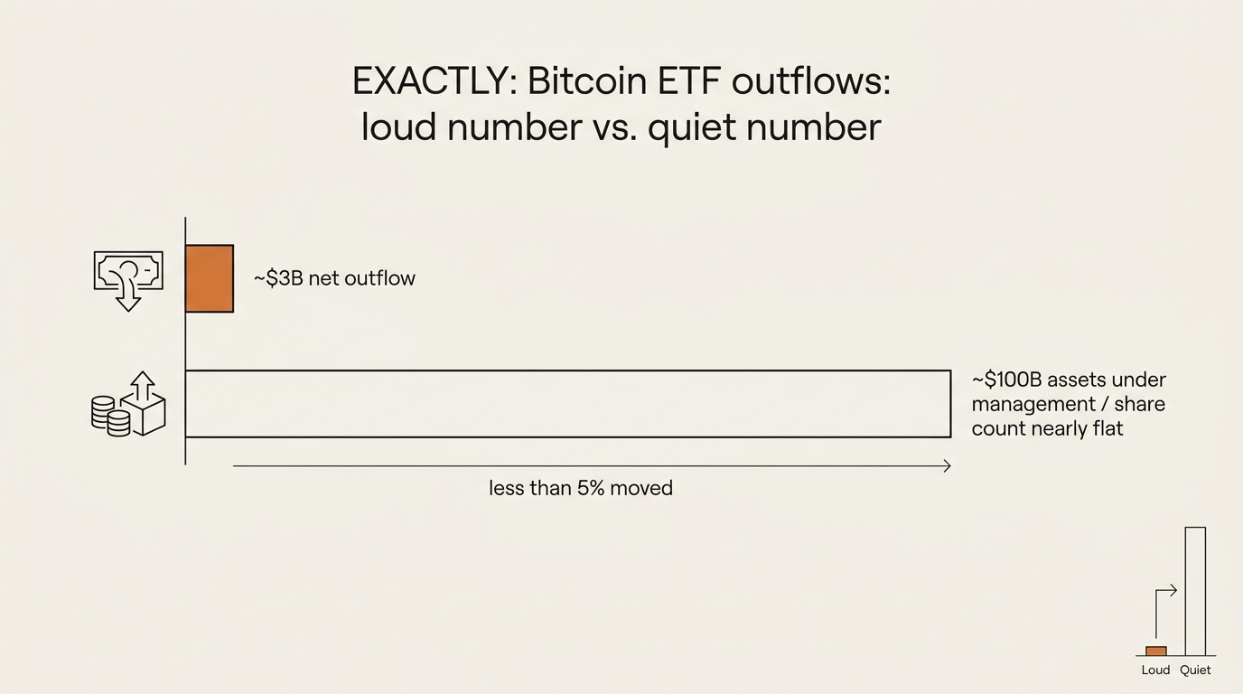
According to CoinDesk’s reporting, the analysts who cover these funds most closely pointed at a number the panic headlines skipped: the share count. While dollars flowed out on paper, the total shares outstanding across the funds barely shrank — and by some measures kept growing through the drawdown. Roughly $3 billion of movement sat on top of an asset base near $100 billion. On that scale, one analyst’s framing was that the outflows looked closer to noise than to capitulation.
Sit with that ratio for a second. Less than five percent of assets under management moved. Cumulative inflows since these funds launched were still measured in the tens of billions — one analyst noted that even after roughly $9 billion exited from the peak, well over $50 billion of net inflows remained in place. The streak was real. The exodus was not.
That’s the metric that reframes everything. Bitcoin ETF outflows measured in dollars tell you about daily plumbing. Share count and percentage of AUM tell you about conviction. When the first number screams and the second number shrugs, the second number is usually describing the actual holders.
If you’ve read my piece on how to read on-chain data for beginners, this is the same muscle. One metric is loud and shallow. Another is quiet and structural. The skill is knowing which one answers the question you’re actually asking.
Reading flows against fear instead of with it
Now layer the sentiment gauge back on top, because the combination is the interesting part.
Extreme Fear plus heavy Bitcoin ETF outflows sounds like confirmation — two alarms ringing at once. But the Fear & Greed Index doesn’t measure what holders did. It measures market mood, built from volatility, momentum, social signals, and survey data. It’s a thermometer for emotion, not a ledger of behavior.
So you can have a market that feels terrified while the people inside the funds barely flinch. That’s not a contradiction. That’s the normal shape of a drawdown. Price falls, mood collapses, the loud money churns at the margin, and the share count — the patient money — sits there doing nothing. The headline reads “fear and outflows.” The structure reads “noise on top, base unchanged.”
I want to be careful here, because this is where finance writing goes off the rails. I’m not telling you fear is a buy signal. People love to point at past Extreme Fear readings that preceded rallies and call it a pattern. There was an episode in mid-2024 — outflows, then a recovery — that gets cited constantly. I’ll use it for exactly one thing: as proof that outflows are not automatically bearish. Not as a forecast. The June 2024 analog tells you the interpretation “outflow equals doom” has been wrong before. It tells you nothing about next week.
The frame is “frameworks, not forecasts” for a reason. I built this whole approach around it — I wrote about that mindset in bases before bets, and reading flows against fear is just one more application. Describe the structure. Refuse the prediction.
Where I was wrong, in detail
I owe you the full version of my 2024 mistake, because the lesson is the post.
Back then I treated a single week of redemptions as a decision. I saw the red number, I read three news recaps that all quoted the same analyst soundbite, and I concluded the institutional thesis was breaking. I didn’t check share count. I didn’t separate arbitrage flow from holder flow. I didn’t ask what fraction of AUM had actually moved. I let a plumbing statistic masquerade as a conviction signal — and I let three articles citing one source feel like three sources.
What broke, specifically, was my unit of analysis. I was measuring dollars per day when the question demanded shares per holder. Dollars per day is volatile, mechanical, and easy to sensationalize. Share count is slow and boring and far closer to the thing I actually cared about.
What I changed: I stopped reading flow headlines as verdicts and started reading them as raw inputs that need at least one corroborating structural metric before they mean anything. What I’d do differently if I could redo 2024 — I’d have spent ten minutes on the share-count chart before I spent ten seconds reacting to the dollar chart.
That’s the entire correction. It’s not sophisticated. It’s just the difference between reading one number and reading two.
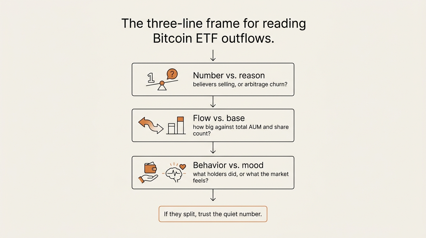
The three-line frame I run now
Here’s the part you can actually reuse. When a “$X billion left Bitcoin ETFs” headline crosses my feed, I run three questions before I let it change anything. None of them require a finance degree.
- Number vs. reason. What actually happened mechanically — is this redemptions from believers, or arbitrage and market-maker churn? If I can’t tell, the headline is an input, not a conclusion.
- Flow vs. base. How big is the flow against total AUM and share count? Three billion out of a hundred billion, with shares flat, is a different story than three billion out of ten.
- Behavior vs. mood. Is the scary part what holders did (flows, share count) or what the market feels (Fear & Greed)? Mood and behavior diverge constantly, and only one of them is a ledger.
If all three point the same direction, fine — that’s a real signal worth respecting. When they split, the loud one is usually the headline and the quiet one is usually the truth. That split is exactly what the recent Bitcoin ETF outflows showed.
Here’s the comparison I keep taped above my desk, in table form.
| What you read | What it actually measures | How loud | How structural |
|---|---|---|---|
| “$4B in Bitcoin ETF outflows” | Net daily redemptions in dollars | Very loud | Low — mechanical, mixes holders and arbitrage |
| Shares outstanding | Whether holders are actually leaving | Quiet | High — patient money |
| % of AUM that moved | Scale of the exit vs. the base | Quiet | High — context for the dollar figure |
| Fear & Greed Index | Market emotion right now | Loud | Low — mood, not behavior |
What I’m tracking from here
I’m not tracking price. I’m tracking the gap between the loud number and the quiet number.
The thing worth watching isn’t whether Bitcoin ETF outflows continue — daily flows will keep zigzagging, that’s their nature. It’s whether share count and percentage of AUM start to confirm the dollar figure. If redemptions keep printing red and shares outstanding fall meaningfully and the move climbs past single-digit percentages of AUM, then the three questions start pointing the same way, and the “holders are leaving” story stops being a headline and starts being a verdict worth respecting.
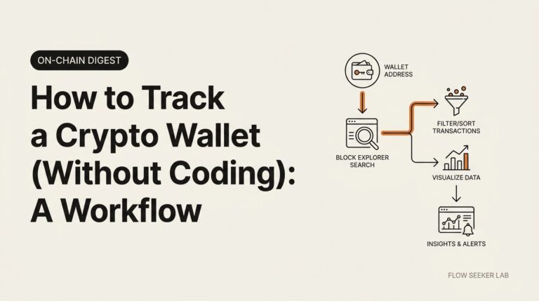
Until those line up, a streak of red flow days against a flat share count is the market doing what it always does: churning loudly at the surface while the base barely moves. You can monitor the raw flow data yourself on a tracker like CoinGlass, and if you want to go one layer deeper into what individual holders are doing, that’s the same habit I covered in how to track a crypto wallet.
One honest limitation before the FAQ. This frame is good at telling you when a panic is overstated. It’s bad at telling you when a slow, quiet erosion is real — because a steady, unsensational decline in share count won’t trip any of my three alarms until it’s well underway. The frame protects you from overreacting to noise. It does not protect you from underreacting to a genuine, patient drawdown. I keep that weakness in view on purpose.
FAQ
Does an ETF outflow mean people are selling Bitcoin? Not necessarily. A net outflow means more fund shares were redeemed than created that day. Some of that is holders exiting, but a large share can be arbitrage desks, market makers, or basis trades unwinding. The dollar figure alone can’t tell you which, which is why share count and percentage of AUM matter more for judging conviction.
Why are Bitcoin ETF investors holding despite outflows? Because the outflows, while real, were small relative to the asset base. Bloomberg ETF analysts pointed out that shares outstanding barely moved and that the dollars leaving were a low single-digit percentage of total AUM. In plain terms, the loud number was churn at the margin, not the core holders walking out.
What does the Crypto Fear & Greed Index actually measure? It measures market emotion, not behavior. The index blends volatility, momentum, social media activity, and survey inputs into a 0–100 score. “Extreme Fear” describes how the market feels, which can diverge sharply from what holders are actually doing with their positions.
Is Extreme Fear a buy signal? No, and treating it as one is a trap. Past Extreme Fear readings have sometimes preceded recoveries, but “sometimes preceded” is not a rule you can trade. The most you can responsibly say is that fear and outflows have failed to predict doom before — which argues against panic, not in favor of a purchase.
How big were the recent Bitcoin ETF outflows? Reports for late May to early June 2026 put the streak at roughly twelve to thirteen trading days and the total near $4 billion, with estimates ranging from about $3.4 billion to $4.4 billion. That was the longest outflow streak since the funds launched in 2024 — but it sat against an asset base near $100 billion, so the scale matters as much as the number.
Where can I check this data myself instead of trusting headlines? Use primary sources. The Fear & Greed Index lives at alternative.me, daily ETF flow data is tracked on tools like CoinGlass, and the holder-behavior reporting I cited came from CoinDesk. Reading two structural numbers next to the loud one is the entire skill.
The reframe
So the real signal in this story wasn’t the outflow. It was the distance between the dollar figure and the share count — and how easily a single loud number can stand in for a decision it was never qualified to make.
Read the quiet number next to the loud one. That’s the whole game.
Next in this Crypto Signal Read series, I’ll do the same teardown on a different gauge: what “institutional accumulation” headlines actually measure on-chain, and where that number lies to you too.
seonjae — Korean office worker documenting his transition into AI systems, agents, and vibe coding — without a CS background. Shipping in public.